V. 1.0
1 May 2019
Home page
Internal page - About us (with colored menu strip)
Early Concept
11 April 2019
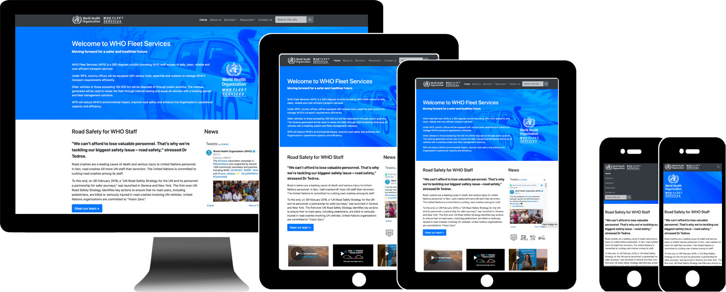
The goal of the following early concept is to provide a starting point to further develop the navigation an responsive UX/UI. When the MS Teams project management tool is ready, team members can add comments and feedback for further development. The neutral monochromatic branding was chosen for the header as to reduce branding overuse as internal pages will often include WHO-WFS visual branding. This will also allow more focus on the main content. We can certainly switch to full colour version should the team prefer a stronger branding.
The main goals of the dashboard is to clearly identify the organization and its role with the WHO and the UN and to communicate the new corporate identity. The navigation hierarchy needs to be direct and not nested more than two or three levels. A search bar is essential to locate important documents / resources that may not be easily exposed via the new navigation structure. The menu structure will need to adapt to the content priorities published on the platform.
The new dynamic dashboard / home page feature will allow all subscribers and stakeholders to quickly access information and resources they require. This dashboard include panels CTAs and links that can be easily highlighted or hidden depending on the publishing priorities. On smaller mobile devices the dashboard will be a single column of panels / text with bandwidth optimized media.
On smaller devices the main menu collapses to a single 'hamburger' icon to prioritize screen real estate. Internal page layouts will follow a similar single or multiple column layout design depending on page content and device resolution.
The emphasis on responsive design allows the content to adapt to the widest possible range of devices and available bandwidths. The standardized responsive twelve column grid layout* is considered best practice the basis for modern responsive web design.
Social media links to external resources have been placed in footer as secondary items. Any supporting social media associated with content should be embedded into the pages to maintain a contextual reference. Custom icons can be used sparingly but should include small titles to avoid any ambiguity as to their purpose.
From the project Terms of reference (TOR)
- Promote information-sharing
- Serve as a repository of information
- Build a community of practice through promoting interactive engagement
Click here or on main image for an interactive layout to demontrate the key responsive layout features.
On desktops - resize your browser window to activate the reponsive layouts.
Research and technical references used to prepare this early concept
SharePoint Grid *SharePoint On-Premises vs SharePoint Online
How to structure SharePoint Intranets
Office 360 UI Fabric elements